


Client:
San Francisco City Impact
Marketing Manager
Graphic Designer
Photographer
Social Media Manager
My Role:
Project Duration:
2 years

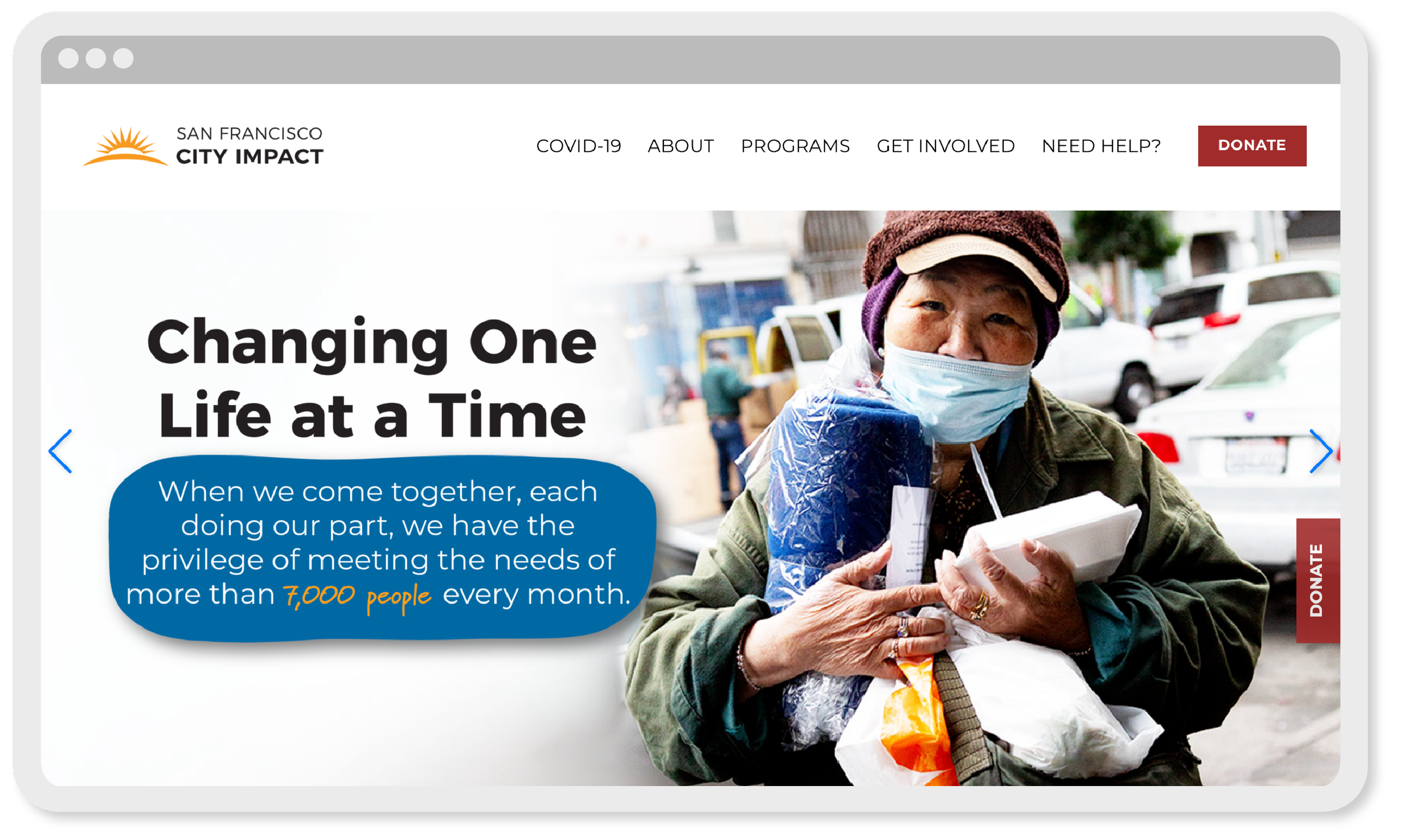
San Francisco City Impact is a faith based non-profit in the Tenderloin neighborhood of San Francisco that serves the tangible needs of the city’s poor and forgotten.
The organization relies on volunteers and donations to operate. Volunteers and donors are individuals desiring to serve their city, local and national churches, and corporations.
Challenge
SFCI needed a brand and marketing strategy to drive relationships with volunteers and donors while also engaging community members seeking services.
Since its inception, SFCI had operated without a formal marketing strategy. After 30 years of growth the existing branding had become inconsistent and required rebuilding in order to bring unity and function.
While the brand needed to reflect SFCI’s many branches serving different areas of the community, it also needed to be modern, friendly, and representative of their origin story.
Process
I served as the marketing manager, in-house graphic designer, and primary photographer for this project alongside the marketing director and a fellow graphic designer. I implemented the new brand in print pieces ranging from signage to info cards and also in digital assets like email banners, website graphics, and slide decks. I managed all social media and provided the majority of the project’s photography. I also helped create administrative infrastructure for the marketing department such as a photo organizing and archiving system.
After evaluating the state of the organization’s marketing, my team concluded it would greatly benefit by improving in two key areas: consistency and visual storytelling. In the 30 years without a defined marketing department, well-intentioned employees created their own materials resulting in a jumbled, quasi marketing strategy. Along with this hodge podge of design, there was no imagery capturing the organization’s story. These challenges defined priorities needed in the brand overhaul.
With the large scope of projects, the team developed a strategic project prioritizing plan. The first step was creating business essentials such as business cards, email signatures, and letterhead which made a cohesive and professional brand. We simultaneously began with enabling our fundraising team to bring in income by equipping them with donor touchpoints and imagery demonstrating areas of need. From there the focus widened to places where people would first interact with the brand such as when signing up to volunteer or visiting on a service trip. Rounding out the brand were designs for areas of the organization that had less impact on revenue streams and outward exposure such as the organization’s school and internal communications like the employee intranet.
Building the brand yielded not only aesthetically pleasing designs but also infrastructure for sustaining the marketing department’s function. Equally important as the quality of the design materials was creating administrative structure. I facilitated bi-weekly project management meetings to ensure forward progress on both the short and long-term deliverables within our newly implemented marketing calendar. I also helped create asset filing systems and implement the project management tool Trello. We equipped ourselves to accomplish projects while at the same time created systems that could live on beyond our time there.
The following are 4 highlights of this rebrand that showcase challenges I encountered and how I solved them.
Marketing Strategy • Print & Digital Touchpoints • Designing for Multiple Platforms
Short-Term Service Trips (Missions Trips)
Challenge 1:


Instagram highlight
Digital flier
Info card

Team member info packet


Promotional postcard
Sticker pack


Postcards
Story sharing card


Training slides & worksheets

Promotional postcards
Challenge
Create cross functional materials for engaging new audiences.
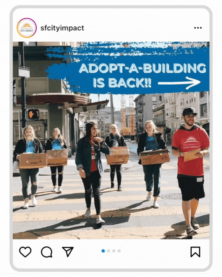
One of City Impact’s main ways of engaging new audiences is through short term service trips, referred to as missions trips. These service trips allow any group from across the country to come engage in the work City Impact is doing with the Tenderloin community. Participants learn hands-on techniques for outreach that they can implement in their own communities, and they also form connections with the Tenderloin and City Impact. Once groups make those connections they likely stay engaged with the work by returning for another trip or giving financially.
These hands-on, often formative service experiences turn participants into great advocates for the organization and long term partners. As such, missions trips present an important marketing window for City Impact.
I created pieces for the missions trip members that spanned their entire journey with the organization. These ranged from promotional pieces to spark their interest in coming, to items that team members interacted with during their time on campus, and also materials that engaged members after they left. These pieces spanned social media, printed mailers, slide decks, and informational handbooks. All items had the goal of building a relationship between the missions team members and SFCI.
Execution
Design started with brainstorming with the marketing director to identify all of the possible touchpoints mission team members could encounter with SFCI. From that list, I broke my design process into two rounds. I started with pieces that were baseline interaction points and then moved into building out more relational touchpoints.
In the first round I designed advertising pieces to engage new audiences and essential informational materials for trip members. First round designs included:
Instagram highlight story panels
Textable digital flier
Printed information card
Advertisement postcard
Missions team downloadable information packet
In the second round I created pieces that focused on building missions team members’ relationship with SFCI. For example I made cards for team members so they could share stories of their experiences from their trip with SFCI. These were great because they served the dual purpose of allowing a team member to connect with the organization and also gave me content to share on social media as I would post a story from each team's trip. This in turn was an avenue to further engage with team members since social media was a main outlet for continued communication with these team members. Second round designs included:
Tenderloin themed postcards
SFCI and Tenderloin themed sticker packs
Story sharing cards
Training slide decks and handouts
More advertisement postcards
Project Management • Spatial Design • Print Installation
Food Drive Collection Bin Design
Challenge 2:


Mock-ups


Challenge
Design wraps for food drive collection bins on a short timeline and small budget.
400+ barrels used for food drive item collection needed to be wrapped with a promotional and explanatory design before they were distributed to apartment complex lobbies across the Bay Area for a campaign in partnership with a regional property management company. The campaign gave our barrel design a hard deadline with a turn around time of about one month.
I was responsible for creating the design, facilitating the print production, and installing the wraps onto the barrels.
Execution
I started with researching printers who could accommodate a 6x2.5 foot full bleed print project in house. Since I had a fast project timeline, I opted for a near-by printer, so I could order and pick up test prints swiftly.
For the design I chose to fill about 50% of the space with 2 images to draw people in visually. I designed in quarter-turn planes of the barrel so that a user could interpret the information completely from any view point. I mocked up the design and gathered feedback from my team. After selecting the images the design came together fairly quickly and the iterations came more in the printing.
Working with the printer, I selected a material that could receive a high resolution print job, be moldable enough to install onto the barrels, and also be durable enough to withstand transport across the Bay Area. I had a tight budget that could not afford a laminated and self-adhesive material. I chose thick paper that was sturdy enough to withstand some battering and could wrap flush to the barrels to reduce damage from gapping. With full scale test prints I tested various techniques for adhering the designs to the barrels. I landed on a combination of tape and glue dots.
I oversaw a group of staff and volunteers to execute wrapping the barrels in the final week of this project.
Social Media Strategy • Digital Platforms • Mixed-Media Assets
Holiday Social Media Campaign
Challenge 3:


Process
Initial mood board options


Sketches & tests


Final style palette & content map


Challenge
Assemble a month of strategic social media posts within one cohesive design in order to engage City Impact’s followers with their mission and capture year-end donations.
As SFCI’s social media manager, I monitored our platforms’ progress by creating monthly Meta Business analytics reports that pulled metrics like engagement rates, follower increase and decrease, and most popular and least popular posts. I also gathered feedback by engaging with followers online and in person. From this data, I knew our followers responded to stories about people who SFCI served and SFCI staff.
With December being an important fundraising month as people make end-of-year donations, my team wanted to capitalize on this and what we knew about our follower engagement to craft a month of posts with stories from SFCI’s year that corresponded with gift opportunities.
The risk in this campaign was the high level of designed posts. Our followers historically engaged less with posts with graphics, but we decided to take the risk because we wanted the whole campaign to stand out against our usual feed.
Execution
I completed this project with the marketing director. Together we created an overall story and content schedule for the campaign. From there, I led the visual design while she wrote the copy for the posts.
During brainstorming we determined all the elements we wanted to include and how to fit them together. These included: donation asks, stories, other points of engagement. We landed on a story arc that reflected on the organization’s year with each week of the campaign corresponding to a different aspect of its work.
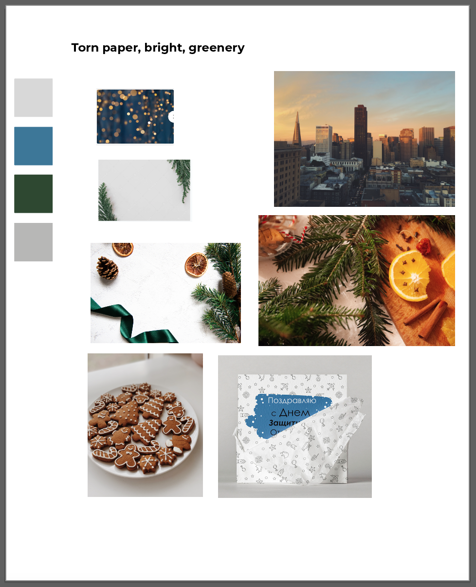
I gathered design inspiration and created mood boards that I presented to our Marketing Director. From our feedback discussions, I created a style palette for the campaign design. The dominant thematic elements I used were grain, torn paper, images of greenery and warm twinkling lights. We wanted the design to clearly read “Christmas,” while simultaneously capturing the grit and beauty of the inner-city.
In the first design step, I created a map of how all the posts would eventually fall in SFCI’s Instagram page. Then I filled in the designs. Posts aligned into one eventual collage on our Instagram page, but they also stood alone as individual posts during the time they were viewed in a followers feed or on Facebook, where we shared the posts as well. I selected about 20% of the posts to be carousels which also had designs that flowed from one post onto the next, so the front facing posts needed to fit into their spot in the feed as well as with the following carousel slides.
Knowing our audience easily grew weary of highly designed posts, I mixed in video posts that had no design as well as posts with dominant engaging images and just a small amount of added graphics.
With all of these specific alignment requirements, I used a private Instagram account only accessible to me and the marketing director to test the posts. The biggest alignment challenge came with videos. I tested thumbnail stills for what looked best within the overall design as well as how they could be captured to incorporate into the designs adjacent to them.
We posted every day at 10am along with story panels to remind followers to view the posts.
Takeaways
We saw success in genuinely connecting with a segment of our followers as we received comments and messages from a consistent group of followers, but we also experienced a lower than usual show of likes than experienced with our regular content. Overall it served as a helpful test as to how our audience engaged and further informed our future social media campaigns such as Giving Tuesday.
SFCI Business & Fundraising Essentials
Challenge 4:
Marketing Strategy• Designing for Multiple Platforms • Print & Digital


Welcome signage
Homepage banner imagery
Meal box sticker
Staff shirt
Tablecloth


Info card
Mask
Thank you note


Email signature
Social media posts

Volunteer email banner


Child sponsorship info cards
Presentation slides
Student portraits for sponsorship
Challenge
Create a baseline of branded materials.
To establish the brand we started with business essentials to bring unity and professionalism to the organization. These were highly visible and frequently used pieces like email signatures, merchandise, and evergreen promo materials.
Since staff members were accustomed to operating outside of a cohesive marketing strategy in the absence of a well defined marketing department, these initial projects also created pathways for staff members to work with the marketing department.
Execution
Due to the all encompassing scope of this project, prioritizing its elements was key. A critical first step involved a thorough inventory and market analysis to discover which existing pieces could be re-worked and repurposed, or where a new item was needed or would better serve. Pieces like T-shirts for staff, email signatures, signage, and printed info cards fell into the first category. While they existed, replacing these high visibility items clearly made a stronger impact in introducing the brand. In the second category there were designs like stickers that went on boxes of to-go meals, email banners, and thank you notes. These designs introduced new touchpoints to boost brand recognition.
Inventorying campus became a constant habit. I was always on the lookout for outdated materials. Finding these often created good conversations with staff about what materials they needed. In that I could learn about gaps or present them with newly created materials and continue to establish the marketing department as a positive resource.
In tandem with creating these pieces, I also established access to organization-wide marketing processes. An example of this was creating email signature templates. I created a template accessible in the organization’s Google Workspace as well as a tutorial of how to update or make an email signature. I then sent an email to all the staff with the tutorial and explained our department’s desire to have the organization have cohesive brand communication starting with things like email signatures. As I helped the staff make this update, I again was working to establish the marketing department as a resource.
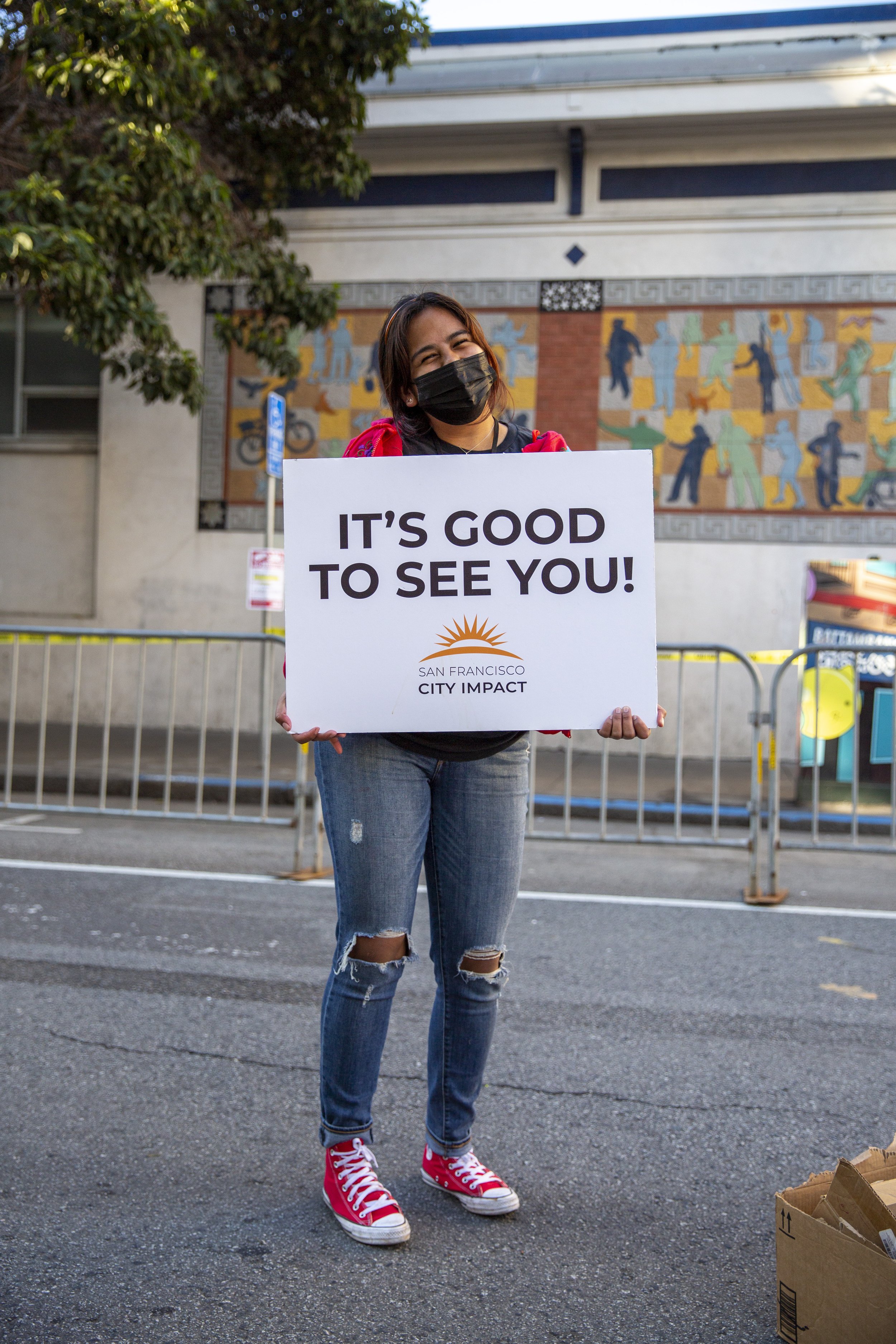
Photography was critically important at this stage as well. The organization lacked relevant photos showing what the organization did. I spent significant time on a weekly basis capturing a variety of different elements of the organization’s work. The marketing director and I also determined specific images needed to complete upcoming projects which I proceeded to shoot. Along with taking photos, I also created a photo cataloging system for the marketing department that housed any existing photos as well as new photos. I linked this storage system to the marketing department’s Lightroom catalog for streamlined and consistent editing.
Concluding Thoughts
Proud Points:
Workflow Efficiency: Creating marketing materials from scratch for an organization with a large span meant there was a great deal of immediate creative demand. As the sole in-house graphic designer and photographer, I was pushed to produce high quality work at a fast pace to fill these needs. We kept our fast pace sustainable by grouping projects requiring less creative energy together so they could be accomplished simultaneously. Then, we inserted projects requiring more creative energy in the project timeline during times when the organization's schedule allowed me creative space. This strategy for balancing project needs against creative energy continues to inform the way I manage time.
Social Media Growth & Photography: Having personally owned the project’s social media and photography, I am particularly proud of the growth in follower engagement I accomplished on Facebook and Instagram as well as the photo library I built for SFCI full of images that represent its work. During the time I managed social media from December 2020 to December 2021, Facebook and Instagram saw a 184% and 120% increase in reach, respectively. And, in my first year as SFCI’s photographer I took upwards of 15,500 photos.
Thorough Deliverables: Our quick and strategic pace allowed us to deliver a thoroughly fleshed out rebrand. I am extremely satisfied with leaving the organization with branded materials for every step of a partner’s journey with SFCI.
Challenges:
Client Communication: My team faced shifting expectations and desires from our client which added pressure throughout the project. This sharpened my communication skills and increased my understanding of my boundaries as a designer for what I can and can not deliver as I work to meet client needs.
Next Steps:
Employee Resource Center: I would further build out a resource center for employees in SFCI’s Google Workspace with more templates and downloadable assets to make the brand even more accessible to employees.
See a comprehensive look at all I designed for SFCI