


Client:
Leaven Kids
My Role:
Graphic Designer
Photographer
Project Duration:
6 months

Leaven Kids is a non-profit organization providing free after-school tutoring and mentorship in low income and high crime rate neighborhoods by operating donor-funded learning centers within housing complexes.
Their proven method has garnered them a high level of community engagement and support from community leaders, politicians, and law enforcement.
Challenge
Leaven Kids needed a large volume of materials and imagery incorporating their new brand standards within a short period of time in preparation for their fourth quarter fundraising.
After rebranding and overhauling their website with a marketing agency earlier in the year, Leaven Kids had a new name, logo, and brand guidelines and now outdated fundraising materials.
Leaven Kids needed their fundraising materials overhauled and an influx of new imagery in time for their annual fundraising gala in the fall as well as for their end-of-year giving campaigns. These new materials needed to accurately present donors to Leaven Kids with the organization’s current scope of projects along with their greatest needs
Process
I stepped in as Leaven Kids’ sole graphic designer as well as a photographer. Since I was creating fundraising materials, the fundraising team was my primary client contact. I worked closely with them to execute their most needed projects and understand the audience they engage. Throughout the process their feedback guided each design.
Leaven Kids does not have a designated marketing or design team, so as the graphic designer, I was the keeper of the brand. My first priority was to understand the brand by looking at their brand guidelines and the one implementation of the brand: the website. From there, I compiled a resource document containing core design elements like background shapes, patterns and pull quote boxes so that I could easily implement them with consistency in my designs. I continued adding to this as I designed and worked through how to best implement the brand. Developing this initial understanding of the brand allowed me to carry out a cohesive design for multiple platforms and functions.
I began by designing materials for Leaven Kids’ annual fundraising gala which created an initial base of donor materials that were also usable outside of the event. I then designed major donor materials and Christmas fundraising pieces.
The following are 3 challenges I accomplished to create a large impact in a short amount of time for Leaven Kids' new brand.
Challenge 1:
Major Donor Materials
Business Proposals • Print Design • Client Communication

Brochure
Iterations:


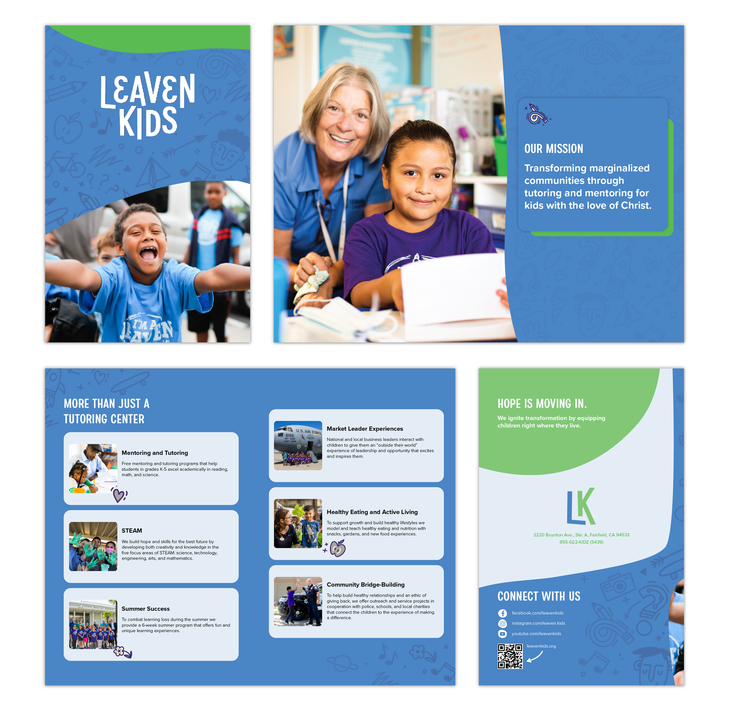
Click on the images above to view full PDFs of each draft.
After receiving client feedback I adjusted the design to better align with the client’s desires. Below is the feedback received and how I adapted the designs for each successive draft:
First draft feedback: Reduce use of white backgrounds; update with new condensed copy; add visual emphasis to certain text sections; present new version of spread 5 with more color, newly provided photos, and without circular image boxes
Second draft feedback: Replace hero image on first spread, update to further condensed copy, photoshop out outdated logos on shirts in some photos
Third draft feedback: Make icons on impact infographic green
One Sheet


Funding Proposal
Challenge
Create materials for current and prospective donors who give at a high dollar level.
These are materials the fundraising team can use to present opportunities for donors to make large and impactful gifts.
I created a brochure, onesheet, and proposal. The first two explained Leaven Kids as a whole with the brochure being an extended format and the one sheet being concise. The proposal invited donors to participate in the specific opportunity of opening new learning centers in Texas.
All materials needed to capture the current scope of the Leaven Kids projects, inspire investment, and have a professional level appropriate to major donor solicitation.
Execution
My main sources for understanding the specific donor group targeted in these designs came from past examples of materials the organization had used and the fundraising team itself. Past materials gave me insight into what kind of communication donors historically engaged with and showed me that donors responded to designs that centered around kids. Images showing kids directly smiling at the camera made a high impact followed by pictures showing the kinds of activities kids participate in at Leaven Kids. From the fundraising team, who had a strong understanding of the donor personas from personal contact, I knew the donor audience was composed of active community members who value investing in the community. There are law enforcement officials, politicians, and military personnel in the donor base. We used patriotic images and pictures with law enforcement and military members to connect with this demographic.
I sent iterations to the fundraising team who gave feedback which focused on how they felt their donors would receive the materials along with copy revisions in response to seeing actual layouts of their words. My challenge was maintaining solid graphic design principals while accommodating the clients desires and preferences. For instance, in one product I submitted a draft with a white background because that fit within brand guidelines and allowed good contrast for the text heavy pages. However, after receiving feedback that the client did not like white backgrounds, I adjusted the next draft and future designs to comply with the client’s wishes. Based on this specific preference, I updated my own guidelines for interpreting the brand standards as they evolved beyond the brand book.
An example of the feedback and iteration process is shown above under the brochure.
Challenge 2:
Event Design & Photography • Spatial Design • Print & Digital
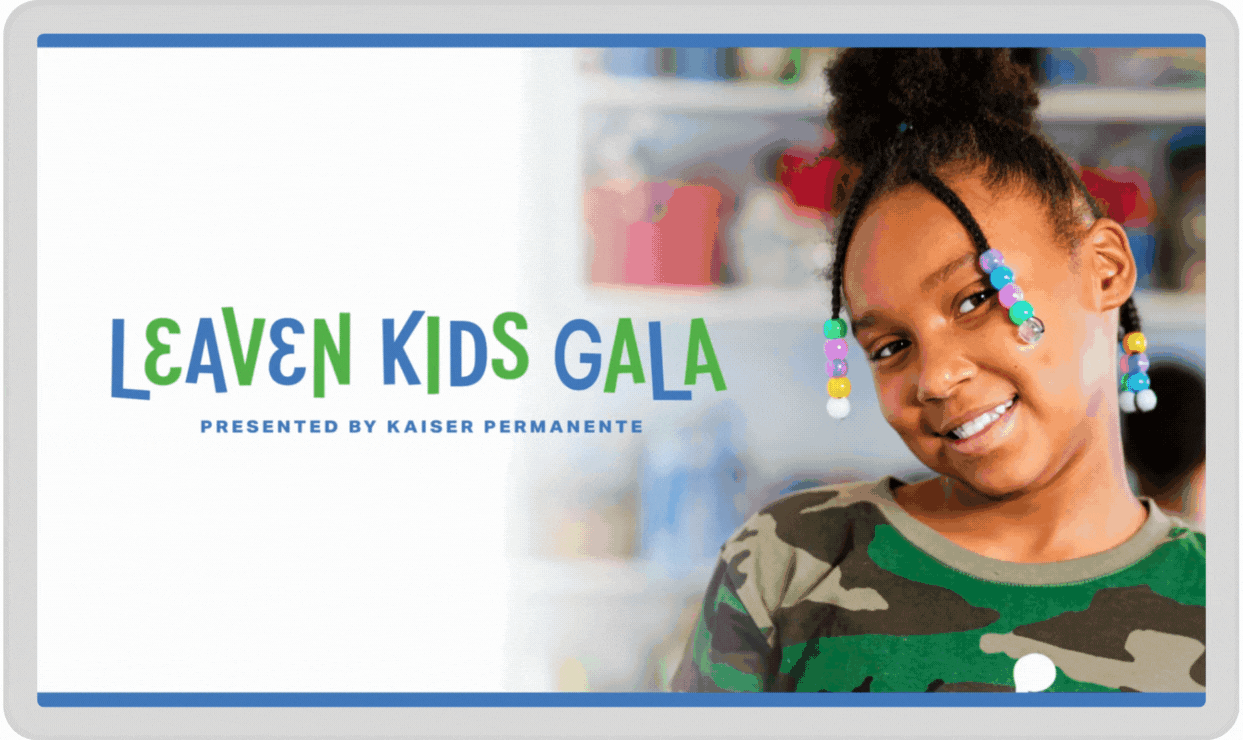
Annual Gala
Invite & Promo
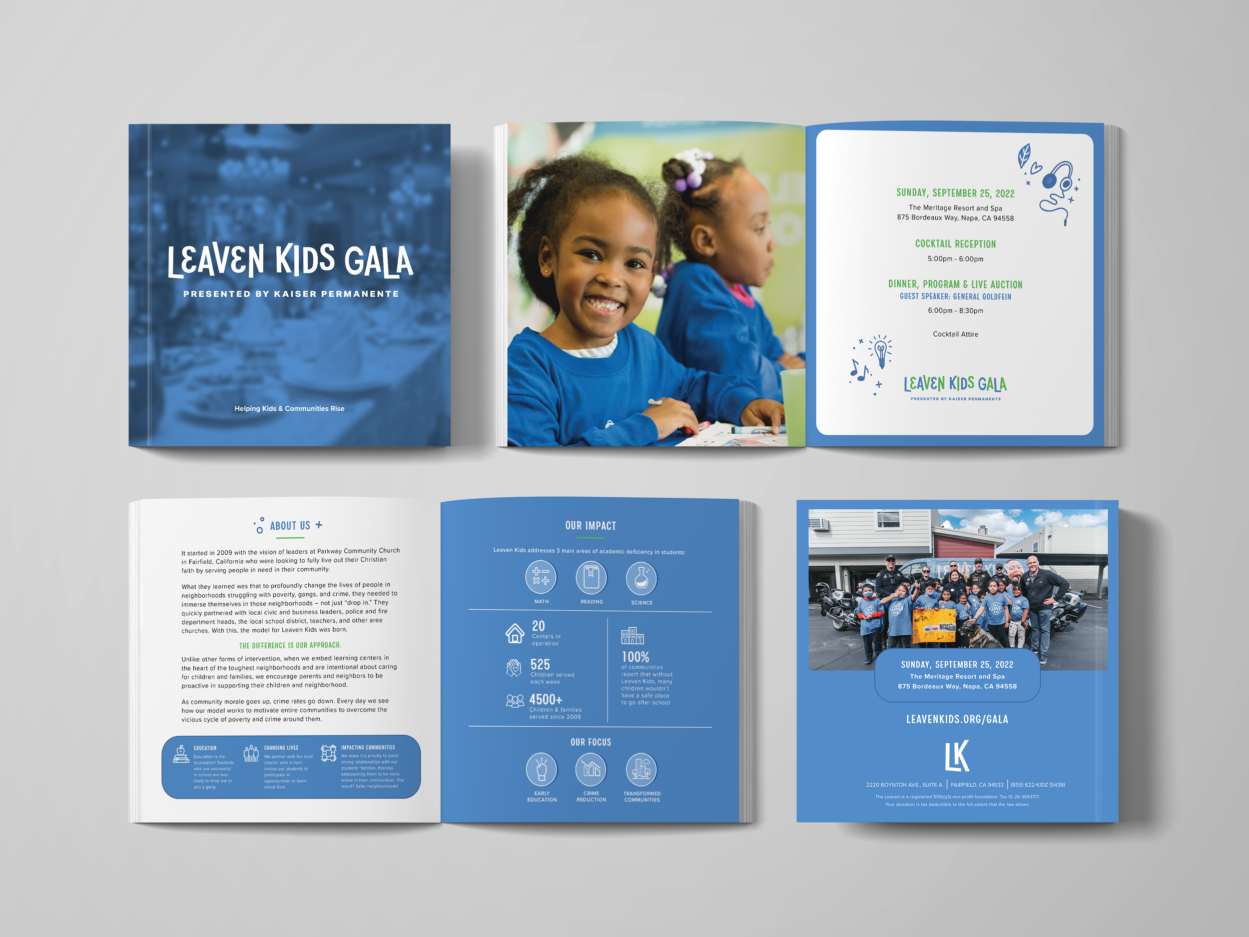


Printed & emailed Invitation
RSVP card


Social media posts and stories
Facebook banner
Event Materials


Welcome signage
Volunteer lanyard


ipad display
Sponsor sign
Table tent sign


Art walls


Program


Child sponsorship table tents
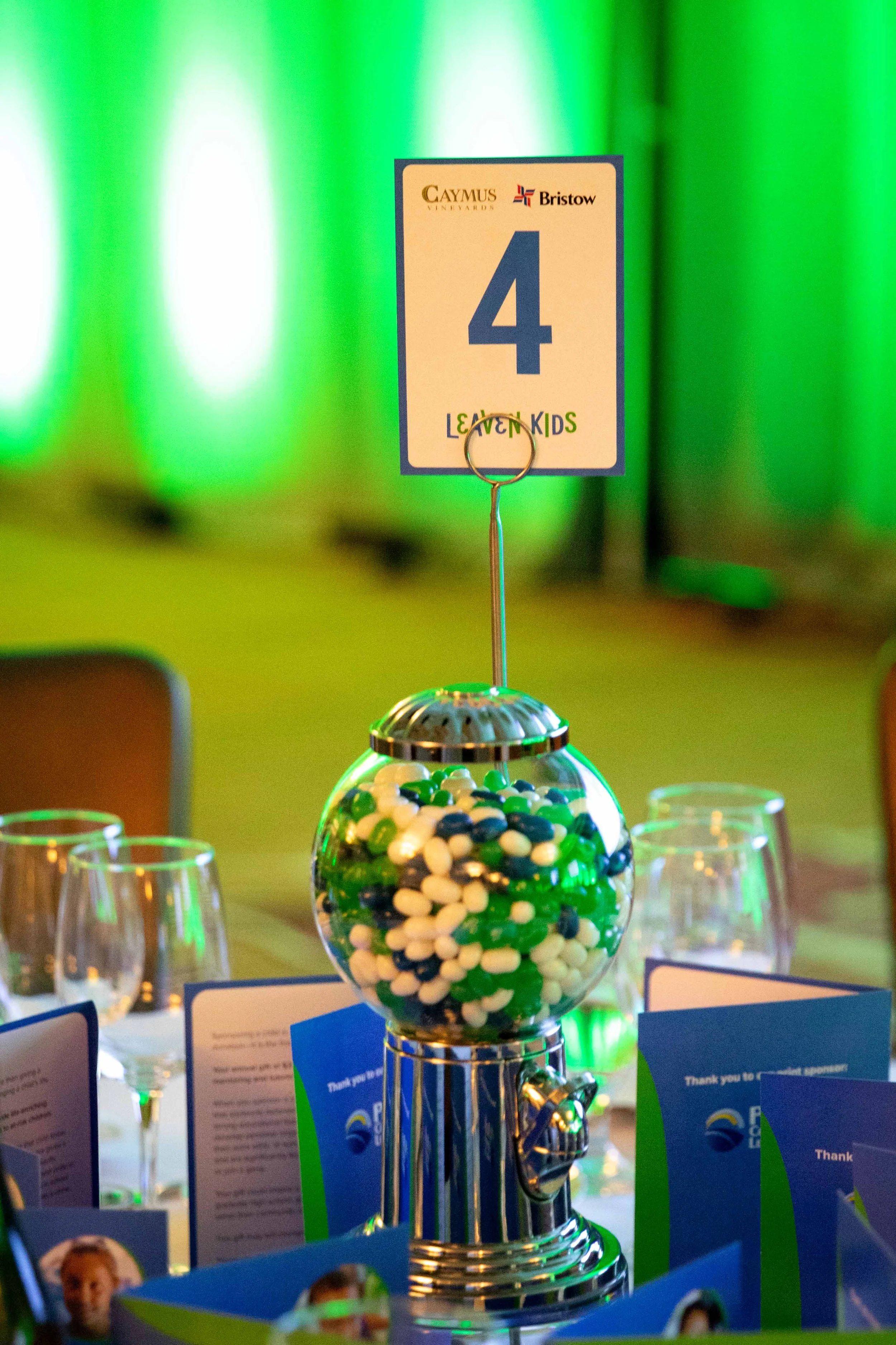
Table numbers


Program slides
Podium sign


Prize certificate and description
Challenge
Design all the materials attendees interacted with leading up to and during the day of the fundraising event.
All designs for every part of the event process from invitations to presentation slides during the event’s program were needed:
Print:
Invitation + return envelope & response card
Event program booklet
Cocktail reception sponsor table tent sign
Stacked cube reception space display
Menu
Auction prize description display
Event sponsor easel signs
Welcome easel signs
Podium sign
Step and repeat press wall
Table numbers
Child sponsorship table tents
Volunteer lanyard badges
Welcome art wall
4 informational art walls
Digital:
Pre-reception invitation email
Program booklet ad purchasing guide
Ipad screen display
Emailed prize certificates
Social media promotion: stories, posts, Facebook page banner
Program slides
I also served as the fundraising team's photographer for the evening. I captured photos specifically geared toward donor and event sponsor thank yous as well as for advertising future events.
Execution
These were the initial projects I executed for Leaven Kids. This was not only a good place to start as the materials were needed with the event approaching, but also it was strategic because some of the materials could be used beyond the event as they were geared toward general Leaven Kids fundraising. Another benefit of starting here was the project list required a lot of different formats from digital pieces like email banners to spatial designs like art wall installations, which allowed me to work through how to best implement the brand.
The brand is friendly, fun, and reflective of the organization's kid-centric nature. It employs hand drawn patterns and icons, rounded edges, and organic shapes. As I implemented the brand I was mindful of balancing these playful design elements with an overall professional feel. For example, if I had the hand-drawn pattern spanning the majority of the background I would use a tone on tone variation at a lower opacity to make the pattern a lower contrast. I would also break up the pattern by putting a different color organic shape around the edges. Or, if I was pulling one of the drawings from the pattern as a stand alone element, I normally would only use one per page or screen. I wanted the playful nature of the brand to come forward without making designs messy or visually distracting.
I set the project timeline to ensure pieces were ready in time for the event. First I created digital promotional materials. Then I made printed pieces for the event, so they had time to be printed. Once those materials were at the printer, I designed digital items for the event day.
Christmas Donor Touchpoints
Challenge 3:
Donor Cultivation & Solicitation Materials • Campaign Design
Donor Cultivation


Christmas card
Gift Box
Emailed party invitation


Social Media Communication
Donor Solicitation

envelope
trifold
response form
return envelope
Mailed appeal for donation

Web Banner
Challenge
Interpret the Leaven Kids brand onto holiday themed designs for Christmas donor relations.
Christmas is a time in donor relation strategies to deploy cultivation and solicitation pieces. During the Christmas season, Leaven kids needed materials to accompany their donor gifts as well as designs for their year-end giving campaign.
A Christmas iteration of the Leaven Kids brand was needed to make the designs.
Execution
I started by creating a campaign style palette for a Christmas version of the Leaven Kids brand. I chose a deep shade of red and green, made a pattern in the style of the Leaven Kids’ pattern using downloaded Christmas vectors, and chose a whimsical font. I maintained the use of organic shapes and fonts from the core brand to keep the campaign designs visually connected to the Leaven Kids brand.
I then created the social media pieces, email and web banners, and the postcard to develop how to best implement the brand on the smaller pieces before moving onto the bigger more dynamic pieces: the gift box and mailed appeal for donations.
I coordinated with the fundraising team to receive feedback on my initial drafts and two separate print houses to bring the gift box and mailed appeal to print.
Concluding Thoughts
Takeaways:
Client communication: Working as an independent contractor for this project required me to clearly define my personal design process in order to communicate to my client what and when I would deliver and also what I needed from them at various stages of the process to complete their projects.
My favorite pieces to design for this were the major donor materials. I love the contrast of designing a high level business proposal that is polished and professional with the playful, child-centric design elements of this brand.
Challenges:
Fast turnaround time: Designing for an event meant I was working with a hard deadline. As we approached the event day, designs had to be turned quickly to ensure everything arrived on time. This kept me diligent in checking my work to prevent simple mistakes slipping through as I moved fast.
Next Steps:
More photography: I would schedule more photoshoots to build a more useful bank of photos that support particular messaging the organization frequently promotes.
Brand clarifications: I would also propose a clearer font hierarchy be added to the brand guidelines so that secondary font usage remains complementary and consistent. As well, I would suggest one or two warm tones be added to the color palette to create contrast and highlight.

Check out more of my design work